Distribution Plots
Distribution plots visually assess the distribution of sample data by comparing the empirical distribution of the data with the theoretical values expected from a specified distribution. Use distribution plots in addition to more formal hypothesis tests to determine whether the sample data comes from a specified distribution. To learn about hypothesis tests, see Hypothesis Testing.
Statistics and Machine Learning Toolbox™ offers several distribution plot options:
Normal Probability Plots — Use
normplotto assess whether sample data comes from a normal distribution. Useprobplotto create Probability Plots for distributions other than normal, or to explore the distribution of censored data. Useplotto plot a probability plot for a probability distribution object.Quantile-Quantile Plots — Use
qqplotto assess whether two sets of sample data come from the same distribution family. This plot is robust with respect to differences in location and scale.Cumulative Distribution Plots — Use
cdfplotorecdfto display the empirical cumulative distribution function (cdf) of the sample data for visual comparison to the theoretical cdf of a specified distribution. Useplotto plot a cumulative distribution function for a probability distribution object.
Normal Probability Plots
Use normal probability plots to assess whether data comes from a normal distribution. Many statistical procedures make the assumption that an underlying distribution is normal. Normal probability plots can provide some assurance to justify this assumption or provide a warning of problems with the assumption. An analysis of normality typically combines normal probability plots with hypothesis tests for normality.
This example generates a data sample of 25 random numbers from a normal distribution with mean 10 and standard deviation 1, and creates a normal probability plot of the data.
rng('default');  % For reproducibility
x = normrnd(10,1,[25,1]);
normplot(x)

The plus signs plot the empirical probability versus the data value for each point in the data. A solid line connects the 25th and 75th percentiles in the data, and a dashed line extends it to the ends of the data. The y-axis values are probabilities from zero to one, but the scale is not linear. The distance between tick marks on the y-axis matches the distance between the quantiles of a normal distribution. The quantiles are close together near the median (50th percentile) and stretch out symmetrically as you move away from the median.
In a normal probability plot, if all the data points fall near the line, an assumption of normality is reasonable. Otherwise, an assumption of normality is not justified. For example, the following generates a data sample of 100 random numbers from an exponential distribution with mean 10, and creates a normal probability plot of the data.
x = exprnd(10,100,1);
normplot(x)

The plot is strong evidence that the underlying distribution is not normal.
Probability Plots
A probability plot, like the normal probability plot, is just an empirical cdf plot scaled to a particular distribution. The y-axis values are probabilities from zero to one, but the scale is not linear. The distance between tick marks is the distance between quantiles of the distribution. In the plot, a line is drawn between the first and third quartiles in the data. If the data falls near the line, it is reasonable to choose the distribution as a model for the data. A distribution analysis typically combines probability plots with hypothesis tests for a particular distribution.
Create Weibull Probability Plot
Generate sample data and create a probability plot.
Generate sample data. The sample x1 contains 500 random numbers from a Weibull distribution with scale parameter A = 3 and shape parameter B = 3. The sample x2 contains 500 random numbers from a Rayleigh distribution with scale parameter B = 3.
rng('default');  % For reproducibility
x1 = wblrnd(3,3,[500,1]);
x2 = raylrnd(3,[500,1]);
Create a probability plot to assess whether the data in x1 and x2 comes from a Weibull distribution.
figure
probplot('weibull',[x1 x2])
legend('Weibull Sample','Rayleigh Sample','Location','best')
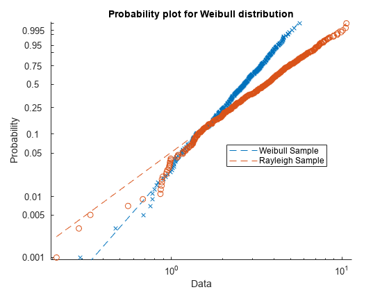
The probability plot shows that the data in x1 comes from a Weibull distribution, while the data in x2 does not.
Alternatively, you can use wblplot to create a Weibull probability plot.
Create Gamma Probability Plot
Generate random data from a gamma distribution with shape parameter 9 and scale parameter 2.
rng("default") %set the random seed for reproducibility
gammadata = gamrnd(9,2,100,1);
Fit gamma and logistic distributions to the data and store the results in GammaDistribution and LogisticDistribution objects.
gammapd = fitdist(gammadata,"Gamma");
logisticpd = fitdist(gammadata,"Logistic");
Compare the distributions fit to the data with probability plots.
tiledlayout(1,2)
nexttile
plot(logisticpd,'PlotType',"probability")
title("Logistic Distribution")
nexttile
plot(gammapd,'PlotType',"probability")
title("Gamma Distribution")

The probability plots show that the gamma distribution is the better fit to the data.
Quantile-Quantile Plots
Use quantile-quantile (q-q) plots to determine whether two samples come from the same distribution family. Q-Q plots are scatter plots of quantiles computed from each sample, with a line drawn between the first and third quartiles. If the data falls near the line, it is reasonable to assume that the two samples come from the same distribution. The method is robust with respect to changes in the location and scale of either distribution.
Create a quantile-quantile plot by using the qqplot function.
The following example generates two data samples containing random numbers from Poisson distributions with different parameter values, and creates a quantile-quantile plot. The data in x is from a Poisson distribution with mean 10, and the data in y is from a Poisson distribution with mean 5.
x = poissrnd(10,[50,1]);
y = poissrnd(5,[100,1]);
qqplot(x,y)

Even though the parameters and sample sizes are different, the approximate linear relationship suggests that the two samples may come from the same distribution family. As with normal probability plots, hypothesis tests can provide additional justification for such an assumption. For statistical procedures that depend on the two samples coming from the same distribution, however, a linear quantile-quantile plot is often sufficient.
The following example shows what happens when the underlying distributions are not the same. Here, x contains 100 random numbers generated from a normal distribution with mean 5 and standard deviation 1, while y contains 100 random numbers generated from a Weibull distribution with a scale parameter of 2 and a shape parameter of 0.5.
x = normrnd(5,1,[100,1]);
y = wblrnd(2,0.5,[100,1]);
qqplot(x,y)

The plots indicate that these samples clearly are not from the same distribution family.
Cumulative Distribution Plots
An empirical cumulative distribution function (cdf) plot shows the proportion of data less than or equal to each x value, as a function of x. The scale on the y-axis is linear; in particular, it is not scaled to any particular distribution. Empirical cdf plots are used to compare data cdfs to cdfs for particular distributions.
To create an empirical cdf plot, use the cdfplot function or the ecdf function.
Compare Empirical cdf to Theoretical cdf
Plot the empirical cdf of a sample data set and compare it to the theoretical cdf of the underlying distribution of the sample data set. In practice, a theoretical cdf can be unknown.
Generate a random sample data set from the extreme value distribution with a location parameter of 0 and a scale parameter of 3.
rng('default')  % For reproducibility
y = evrnd(0,3,100,1);
Plot the empirical cdf of the sample data set and the theoretical cdf on the same figure.
cdfplot(y)
hold on
x = linspace(min(y),max(y));
plot(x,evcdf(x,0,3))
legend('Empirical CDF','Theoretical CDF','Location','best')
hold off
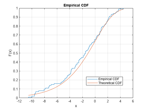
The plot shows the similarity between the empirical cdf and the theoretical cdf.
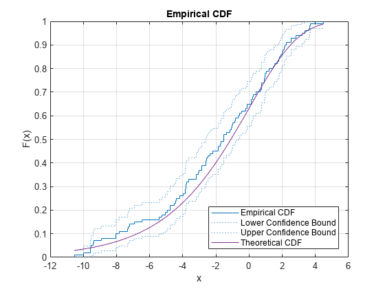
Alternatively, you can use the ecdf function. The ecdf function also plots the 95% confidence intervals estimated by using Greenwood's Formula. For details, see Algorithms.
ecdf(y,'Bounds','on')
hold on
plot(x,evcdf(x,0,3))
grid on
title('Empirical CDF')
legend('Empirical CDF','Lower Confidence Bound','Upper Confidence Bound','Theoretical CDF','Location','best')
hold off
Plot Binomial Distribution cdf
Create a binomial distribution with 10 trials and a 0.5 probability of success for each trial.
binomialpd = makedist("Binomial",10,0.5)binomialpd =
BinomialDistribution
Binomial distribution
N = 10
p = 0.5
Plot a cdf for the binomial distribution.
plot(binomialpd,'PlotType',"cdf")

See Also
normplot | qqplot | cdfplot | ecdf | probplot | wblplot
Related Topics
You can also select a web site from the following list:
Americas
- América Latina (Español)
- Canada (English)
- United States (English)
Europe
- Belgium (English)
- Denmark (English)
- Deutschland (Deutsch)
- España (Español)
- Finland (English)
- France (Français)
- Ireland (English)
- Italia (Italiano)
- Luxembourg (English)
- Netherlands (English)
- Norway (English)
- Österreich (Deutsch)
- Portugal (English)
- Sweden (English)
- Switzerland
- United Kingdom (English)